Histogram: Key Takeaways
- A histogram lets you quickly see all the tones in a photo
- Look for peaks pressing up against either side of the graph (these indicate highlight and shadow clipping)
- A bell-curve histogram is generally best
- The histogram will naturally appear skewed to one side when you photograph dark or light scenes
- The expose-to-the-right (ETTR) technique helps improve image quality
If you want to take your photography to the next level, fast, then you should learn to use a histogram.
Because a histogram will give you a reliable way to check your exposures, in-camera.
And it’ll stop you from making mistakes, such as accidentally clipping highlights or shadows.
It can also help you reduce the noise in your images.
So are you ready to improve your photos?
Let’s dive right in.
Histogram in Photography:
What Is a Histogram?
First things first:
What actually is a histogram?
A histogram is a graph that represents all the tones in your photo.
It looks like this:
Now, look at the X-axis, across the bottom:
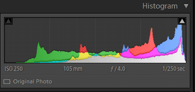
Moving left to right, this indicates the darkness and brightness of tones. The blacks are represented on the far left, the whites are represented on the far right, and the midtones are represented in the middle.
And look at the Y-axis (the left and right vertical):
This refers to the amount of a tone that’s present in a photo.
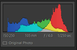
So if there is a peak in the middle of the histogram, it indicates a lot of midtones in the image:
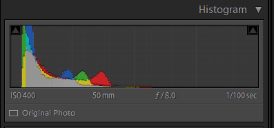
Whereas a histogram that’s skewed to the left indicates a lot of dark tones in the image:
And a histogram that’s skewed to the right indicates a lot of bright tones in an image:
Note that a histogram can be pure greyscale when showing an overall representation of an image:
Or it can be broken down into colors, like the examples above.
In the above example, the individual colors are represented on the graph, which just gives you a bit more information to work with.
For instance, do you want to know if the reds are too light or too dark? Look for the red parts of the histogram, and it’ll tell you.
To recap:
A histogram shows you the different tones in your image.
Peaks on the far right indicate pure white tones, peaks on the far left indicate pure black tones, and anything in-between indicates shadows, highlights, and midtones.
Make sense?
Now let’s take a look at why this actually matters, and how doing photography with a histogram can make such a big difference.
How Can a Histogram Improve Your Photos?
A histogram allows you to determine the exposure of an image with a single glance.
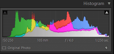
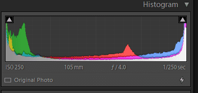
Specifically, it lets you see whether you’ve done any highlight clipping, where you lose information in the highlights. This is represented as a peak pressing up against the rightmost part of the histogram, like this:
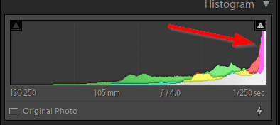
It also lets you see whether you’ve done any shadow clipping, where you lose information in the shadows. This is represented as a peak pressing up against the leftmost part of the histogram.
And the histogram lets you see the midtones of a photo, and whether they’re too dark, too bright, or just right.
You may be wondering:
Why can’t I just look at the image on my camera LCD?
Unfortunately, camera LCDs just aren’t that reliable for evaluating exposure in the field. For one thing, the ambient lighting makes it hard to tell whether a part of your photo is too dark or too light. Plus, the screen is so small that it can be hard to tell whether you’ve skewed the photo toward overexposure or underexposure.
If you’re a mirrorless photographer with an electronic viewfinder, you may protest–because, after all, you have an EVF that looms large in front of your eye, and that you can use to evaluate exposure.
But the truth is that even EVFs can result in exposure mistakes; it’s easy to think that you haven’t overexposed or underexposed an image, when in reality you’ve done it consistently.
Enter the histogram.
Most cameras have the ability to display the histogram in the field, which you can then use to check your exposure. You don’t have to give up on using the LCD, but you can use the histogram as a way to ensure you’ve absolutely nailed the shot.
And this will prevent you from making embarrassing mistakes, such as overexposing every single photo from a portrait photoshoot and having to inform your subject afterward.
Or catching some amazing evening light but failing to capture the moment, thanks to a too-dark exposure setting.
Using a Histogram in the Field
If you’ve never used a histogram when out shooting, don’t worry–I have an easy workflow you can use.
First, set up your camera so that the histogram appears on your LCD screen or on your mirrorless EVF display.
This shouldn’t be too difficult, but the process will differ from camera to camera, so check your manual.
Next, expose the image to the best of your ability and take a first shot.
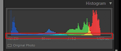
Take a look at the histogram. In particular, you’re going to look at three points:
Your blackpoint, where the histogram reaches the left end of the X-axis:
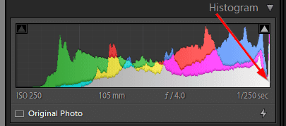
Your whitepoint, where the histogram reaches the right end of the X-axis:
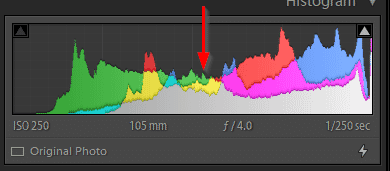
And your centerpoint, or midpoint, right in the middle of the X-axis:
Then mentally zoom out, and look at the histogram as a whole.
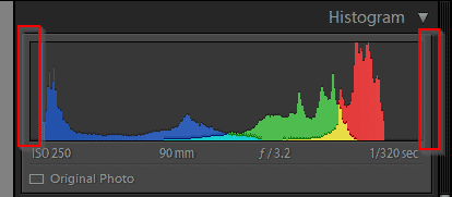
When you look at the blackpoint, ask yourself:
Do I see any peaks pushing up against the edge? If the answer is ‘yes,’ then drop your shutter speed, widen your aperture, or boost your ISO.
If the answer is ‘no,’ then continue on to the next step.
When you’re looking at the whitepoint, ask yourself, once again:
Do I see any peaks pushing up against the edge? If the answer is ‘yes,’ then raise your shutter speed, narrow your aperture, or lower your ISO. If the answer is ‘no,’ then continue to the next step.
(Note that the size of the change you need to make depends on the individual image. If the histogram is really pushing hard up against an edge, you may need to adjust your settings by a stop or more. But if your histogram is just barely nudging the edge, then only a small adjustment will be necessary.)
Third, look at the midpoint on your histogram. Is the image generally concentrated in this area?
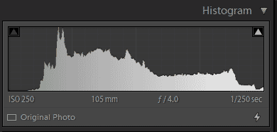
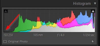
The most obviously well-exposed images will display something close to a bell curve.
Whereas images that are underexposed will have the main peaks skewed to the left, and images that are overexposed will have the main peaks skewed to the right.
Now, here’s where things get a little tricky:
If your image is pretty average in terms of its tones, then it should have a bell-curve centered around the middle of the shot. And you should make adjustments to your settings to achieve this.
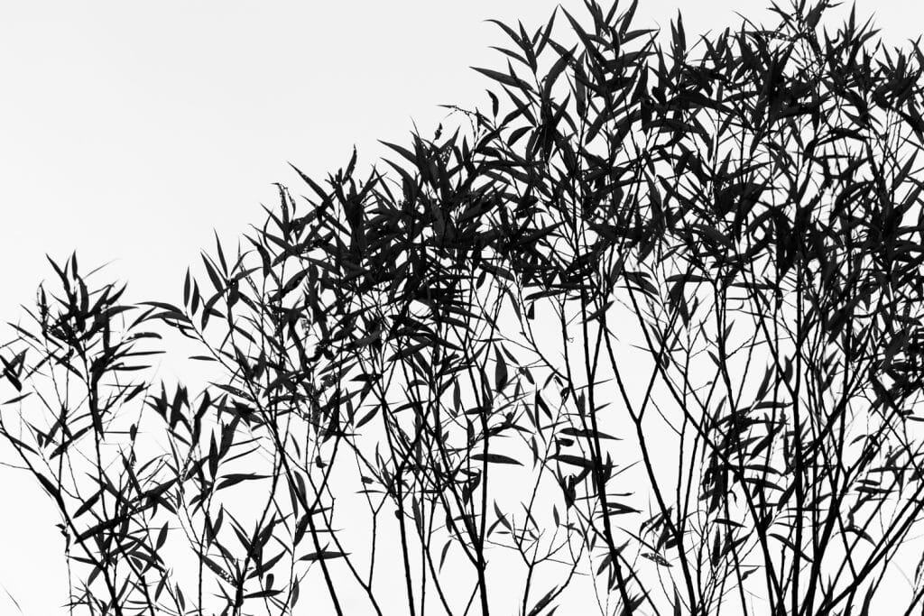
But if your image is meant to be dark–as in, it has a lot of dark tones, or it’s deliberately low-key, like this:
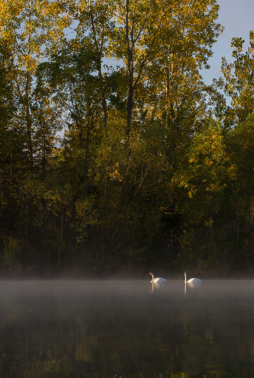
Well, then you should see the graph skew to the left.
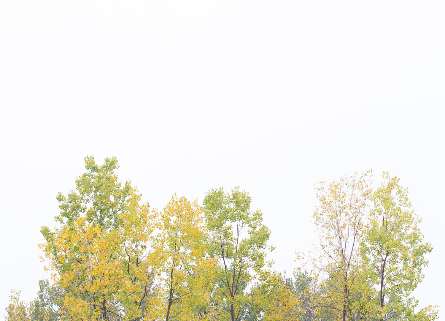
And if your image is meant to be bright–because it includes a delibeartely blown out sky, or just a lot of light subject matter–then you should see the graph skew to the right.
This is normal, and completely okay. Though I do recommend you avoid shadow clipping and highlight clipping as much as possible, unless you’re sure that you want to get rid of the detail in certain areas.
Which brings me to last step in the histogram photography workflow:
Look at the histogram as a whole. Make sure you didn’t miss anything, and make sure that you’ve made all the necessary adjustments to correct for shadow clipping, highlight clipping, and midtone skewing.
Got it?
Then take a second shot, before peeking once more at the histogram. Make sure your corrections have worked–that you’ve got detail in all the whites, detail in all the blacks, and a nicely positioned midpoint.
Photographing Scenes With Clipping on Both Ends of the Histogram
If you shoot under harsh lighting, or you photograph shots that naturally have a mix of very bright and very dark tones, you’ll run into a very frustrating situation:
Your histogram will show clipping on both ends.
In such a case, you can’t make any exposure adjustments that’ll prevent a loss of detail.
So you have two options:
Decide whether the highlights or the shadows are more important, and sacrifice the area you care less about.
Or come back and shoot again, but under softer lighting.
One thing to bear in mind is that you can generally recover a lot of shadow detail. Whereas highlight detail, once lost, tends to remain gone.
So if you’re going to sacrifice something, go for deliberate underexposure.
Exposing to the Right (ETTR)
If you want to get good exposures that have detail in every area of the image, it generally pays to produce a bell curve style histogram, one that peaks in the middle, like this:
But there’s actually another technique that’s popular among some photographers, called Expose to the Right (ETTR).
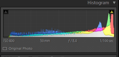
Instead of producing a histogram with a nice bell curve, the ETTR method urges you to produce a histogram like this:
One that skews to the right, but doesn’t actually clip the highlights.
But is this actually a good idea?
Sort of.
Because here’s the thing:
The brighter your exposure, the less noise will be apparent in your images.
And brighter exposures also have more latitude in post-processing, allowing to easily raise or lower your exposure without the addition of unwanted noise.
So if you can overexpose slightly, but stop just before you clip any details, you can end up with the best possible image file.
But here’s the problems with the Expose to the Right technique:
First, it’s risky. If you use ETTR but you get the exposure wrong, even by a little bit, your entire shot will be ruined.
And second, it requires post-processing. You’re not going to be able to use your camera’s files immediately. Instead, you’ll have to lower the exposure back down, which can take a bit of time, especially if you do it with all your photos.
Ultimately, the decision is yours. But you can get great files when aiming for a standard exposure, so don’t feel like Expose to the Right is the only way to go.
Using a Histogram to Improve Your Photos: Next Steps
Now that you’ve finished this article, you should know all about histograms:
What they are, how they work, and how they can help you get beautifully exposed photos.
Because with proper histogram technique, you can ensure that you never come home with an underexposed or overexposed image again.
And you can ensure that you definitely avoid all highlight and shadow clipping.
So go grab your camera right now and set it up so that it’ll show the histogram.
Your future photos depend on it!
What is a histogram?
A histogram is a representation of all the tones in your photo. It indicates the brightness of every pixel in your photo with peaks on a graph.
Why does a histogram matter?
The histogram allows you to ensure you achieved a perfect exposure after a shot. You don’t have to rely on an inaccurate LCD; instead, by checking the histogram, you can determine whether you’ve produced a shot that’s too dark, too bright, or just right.
Can I view the histogram on the back of my camera?
Absolutely! Most cameras allow you to view the histogram of an image via the LCD. If you have a mirrorless camera, you may even be able to view your camera’s histogram in real time (via the EVF or the LCD).
Please add me to the newsletter